OLD POST ALERT! This is an older post and although you might find some useful tips, any technical or publishing information is likely to be out of date. Please click on Start Here on the menu bar above to find links to my most useful articles, videos and podcast. Thanks and happy writing! – Joanna Penn
One of the main reasons for self-publishing is creative freedom and control.
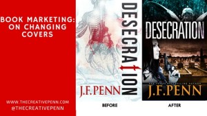
Today I'm talking about changing book covers because within a few hours, you can completely change the look and emotional impact of your book. When authors like Polly Courtney have resigned over the cover branding for their books, this seems like the ultimate indie freedom.

It gets brilliant reviews, so once people read it, they love it. But not enough people were trying it … sure, I haven't done any specific promotion, but based on my other book sales, it should be doing better.
The ‘aha' moment
Russell Blake, the author who has sold over 400,000 thrillers and now writes with Clive Cussler, wrote a post in Feb 2014 about tweaking his covers. Russell changes covers in order to “find one that resonates with my readership – as expressed in increased sales.”
He changed the cover on one specific book, Fatal Exchange, four times before settling on the latest iteration – which moved from a theme based to a person based cover.
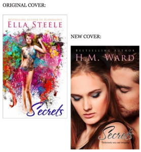
“COVERS ARE STOP SIGNS. They should quickly reveal as much info about your book to the reader as possible and this did not. As soon as I changed the covers to the current version, sales shot up … Short version: I was really stupid. Don’t wait 9 months to change covers or descriptions on books that aren’t preforming.”
These two fantastic indie authors provided me with an ‘aha' moment, and this is what I decided.
My mistake #1: Theme over character
I always have a strong theme in my books, and for Desecration the main theme is anatomy and whether the physical body actually defines who we really are. Yes, this is a deep and meaningful topic and I explore the use of the physical body in life through tattoos, body modification and alternative nightclub Torture Garden. I also write about the use of the body after death in medical specimens and corpse art.
But mainly it's a murder mystery with a British detective, Jamie Brooke, whose daughter is dying. Jamie will do anything to protect her daughter in life … and in death.
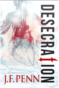
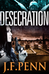
For the second cover, the brief was: grieving mother who will do anything to avenge the wrong done to her daughter, and to bring justice to the murder victim. It was all about character.
My mistake #2: Not meeting genre expectations
Desecration is a crime thriller, with an edge of horror in parts. It's certainly not for the squeamish. It has a dark tone and a 
People have also said the original cover looks very arty, very literary fiction. The font down the side is beautiful but not easily readable and the word ‘Desecration' is difficult for some anyway. It's the HM Ward mistake – falling in love with the art, and not thinking of the reader expectation first.
The white cover also didn't really fit with my other J.F.Penn books which are all dark. The new image of all my books together looks a lot better with another dark book in the frame, as above right.
Comments from Derek Murphy, my cover designer

“We tried a lot of ideas with the first round for Desecration, using mostly symbolic elements. Joanna previously had been adverse to using people on covers so we kept things simple; the final cover she chose is interesting and unique – but wasn't selling well. Here are some reasons why:
1. No emotional connection. Emotion is mostly a matter of scene, color and contrast, although adding characters can help a lot as well.
2. People usually sell covers. Even if a little cliche or overused, stock photo models seem to increase sales.
3. No genre identification. Symbolic covers are better for non-fiction. The stern white, while clinically suitable, probably seemed too much like a non-fiction book. At the very least it was unclear what the book was about – this could have been improved with a tagline.
4. No depth. Adding a scene lets readers know more about the setting and feels more like they can ‘walk into' the story. It's tough to pull off a flat, symbolic cover (even though major bestsellers seem to use them, like the Game or Thrones series, Twilight, Shades of Gray, etc.)

You can find Derek at Creativindie Book Covers, and he also has this great post about DIY Covers in MS Word, as well as a fantastic program to help authors with book cover design. You can find more cover designers here.
The new cover
I am really happy with the new cover!
I spent over 5 hours trawling through all the image sites looking for my idea of Jamie Brooke, the main character. This model totally fits the bill. Of course, British police detectives don't carry guns, but I decided a little artistic license would suit the American audience more 🙂
I've also just uploaded the new print covers to Createspace, so if you have one of the older cover print books, it is officially a limited edition!
In terms of results, it's difficult to say yet. The ranking on the Amazon.com store has moved from ~200,000 to ~50,000, but I have also been involved in other promotions this month. It will be best to wait a few months and see how the average sales are over time.
Tweaking my other covers

I also searched hard for this model, who fits incredibly well since my Dr Morgan Sierra is closely modeled on Lara Croft!
Although it's hard to do any kind of split testing when you only have one book, I have now had two free runs on BookBub for Pentecost.
The first run resulted in ~20,000 free downloads. This latest run with the new cover resulted in over 30,000 downloads. I can't directly attribute it to the addition of the female figure, but at least it shows that the cover change wasn't detrimental, and could mean it was a positive move. Pentecost is still free on all stores if you fancy trying it.
OK, I would love to hear what you think. Firstly, what do you think of my cover change? Do you think the new covers are more effective? Also, have you changed your own covers and has this impacted sales? Please leave a comment below.
Another vote for the first Desecration cover simply because it’s beautiful. I would look at that more than the new one, but perhaps because I have a design background and appreciate the detail in it on a different level, my behaviour might not reflect that of the average reader. (Funnily I prefer the Pentecost cover with the woman.)
As such, I’m struggling a bit with my own covers as well because indeed it’s choosing between genre conventions and personal taste. But there’s another, added dimension to my problem: in my genre (what Kobo eloquently call “active romance”), or even in mainstream romance, most of the covers seem to feature models which in no way resemble my characters. Everyone’s perfectly airbrushed, there are six pack abs all over the place, etc. If I do a people-based cover but remain true to my work, not only am I going to have a real challenge identifying stock images that work, I worry the “not conventionally hot people” may put people off who would actually enjoy the story once they got into it. So I’ve stuck to largely abstract imagery with my novel length release featuring a pair of sexy shoes on the front.
What does one do when the books don’t fit into genre stereotypes? Romance without alpha males, erotica without toned, muscular bodies?
You’re so right about the active romance covers – they are all perfect – but aren’t we selling the dream?! well, maybe the ones about the billionaires are, for sure. I think there is a huge opportunity for a business that offers less obvious stock photos for indie book covers 🙂 We can’t all be doing our own shoots! It is a tough decision – and arty creative vs genre specific will always be hard.
Lol selling the dream yes, but I was rather banking on the possibility that there are as many dreams as there are people and some might enjoy fantasising about Average Joe who sat opposite us on the train and who we could have a reasonable chance of dating one day 😉
I would be all over a company offering more variety in terms of stock photos, hopefully someone runs with that idea. 🙂
I get everything you’re saying, and I agree with you. But the Desecration cover was just so beautiful 🙁
Maybe a combination of theme and character can work, as long as the cover doesn’t get too crowded.
Book covers are your most important marketing tool, I agree, and I’m really conscious of this, but how often can you change your cover? I have two (connected) romances which weren’t selling as well as I’d hoped, so I had my daughter, who made me absolutely gorgeous covers for my New Adult romances, update my others and, if possible, they’re doing even worse! But I just changed them. So how soon can I change them again?
And I love your new cover. It speaks to me much more than the first one.
Thanks Merry – I wanted the cover to speak, so great to hear that! On frequency of changes, I guess that’s up to you. Rebranding lots together is a great idea, and maybe changing regularly will un-nerve existing customers. Russell Blake as mentioned above changed his 4 times in a year or two I think. But there are no rules 🙂
I think the stock art = stock characters argument is weak and harsh on indies. Most of us, especially those of us starting out, can’t afford $500+ photo shoots and costuming. And honestly, plenty of traditional book covers present historical figures (women) with makeup. I caught some flak from die-hard historians over my Viking having makeup, but the truth of the matter is that we toned DOWN her makeup before the book went to print, as much as possible. The idea that my book isn’t going to have deep characters, because I chose an eye-catching female to represent it, is pretty appalling. If I were an artist, sure, I could design some really quirky/unusual cover art. But I’m not. I have to work with what I have. I think we’re putting even more pressure on authors who are working their tails off to put out their best products by expecting them to plunk down all kinds of money for a photo shoot/artist. Most indies I know (Joanna, Heather Sunseri, above), put a LOT of time and effort into choosing just the right stock model that captures the general look of their main characters. If you really want to judge a book by its cover, what about photoshopped covers which were obviously thrown together overnight? THAT might tell you more about an author’s dedication to putting out a finished product. I’ve personally spent days going through stock art to find JUST the right picture that captures my book, not to mention the weeks or months that goes into finding just the right font/background. As Joanne said, we have to make covers that appeal to our audience. If you are a fan of literary fiction, you’re not going to love stock art covers. But if you’re a fan of a face on a cover, you will. I personally enjoy both, but as an author, I have to decide which look will draw in my reader demographic. I’ve even ASKED my readers about it…and they are also fans of a face.
Thanks Heather – I never used to like faces, but they are growing on me 🙂
Joanna, that Pentecost cover now makes it a MUST buy! I have to admit that I too saw the book as a thriller, yes, but as a religious, historical one. Not my cup of tea, I thought. But, I didn’t know it involved a kick-ass heroine a la Lara Croft! Well, now… 😉
I’ve always suspected that maybe my covers were keeping my books from selling. They’re wonderful covers, but some feedback I’ve gotten is that folks think I’m selling comics. So, I’m going to commission new covers and put new books out for convention I’m attending in a couple of weeks. I’ll have the new covers AND the old covers (existing stock) side by side.
It will be very interesting to see which stacks people buy from the most. A-B testing, live! Thanks to this article, which is the sole reason I’m doing this.
Thanks again, in general, for all of your always helpful articles. You share so much with the rest of us, it’s quite inspiring.
Best of luck with your new covers and keep us posted on your sales (post-give away) of Pentacost especially.
I’m glad you like the kick-ass Pentecost cover, Carl 🙂 I think it must be making a difference to the appeal as the free download rate is definitely up, as are my email list signups. Have fun with your new designs!
Changing a cover is much easier on a POD book. It’s much, much harder when you already have 1500 copies of a book in the warehouse. (Those of us who sell to the book trade through a traditional distributor really can’t print POD because of the higher unit cost.) That said, I did change covers on two books: one for my first book and one for the second book I published (by another author). Sales were flat and it made more sense to write off the remaining 50 copies and update the cover. For one of the titles, we immediately sold 5000 copies after the cover change. The other is getting new life breathed into it as well.
Hi Jo
The new one looks good and as you say, fits much more neatly with your genre.
After our discussion, we’re doing the same thing. I have a comic artist working on designs and characters for the Assembly trilogy so by the time the second one’s ready to launch, we’ll have both covers ready.
Pentecost looks good as well.
Hope you’re flogging those limited editions for a good price 🙂
Mike
I only have a few of those limited edition ones left Mike 🙂 I’m going to keep them for posterity!
Creative Penn,
I love these ideas! I will definitely consider implementing them in my own book cover design. I’m working on a collection of flash fiction. What would you suggest for that, since it has multiple characters and slightly varied themes?
Def food for thought. I like simple abstract covers, but I must remember I’m not selling my books to myself. When I posted a romantic, foo-foo cover for my newest book, my page lit up. Everyone loved it. I thought it was too busy. No one else did. Yank on those heartstrings & you’ll move books. That’s what we’re here for.
If I had to vote and chose between the 2 covers, I would vote for the 1st one. It is a real beauty… and has higher quality.
Joanna, I will be SO interested to see what affect your cover changes have on sales. I know you will keep us posted. 😉
This is something I’d like to do with my seven-book series–the current covers are distinctive but have never really screamed fantasy. Now that I can afford it, I would like to get custom illustrations done for the whole series and relaunch it with a better series name (like many authors, I made the mistake of simply naming the series after the first book). It’ll take a while to go back and forth with an artist, so I’m not rushing into things, but I hope to give this a try this summer. 🙂
That sounds like a great idea Lindsay, although I think your covers are pretty cool already 🙂
I recently entered my adventure travel story into a virtual tour, where it was given away free to reviewers in the USA, India and the UK. It was only through their independent comments that some reviewers told me, “Loved the story, but probably wouldn’t have chose it based on on the front cover.”
After reading the story, some reviewers gave me a 4 or 5 star score on Amazon.
I had similar feedback from a few winners after my Goodreads Giveaway (Great book but the cover is average)
So I am going to give it a go and get it changed.
I have trawled through so many stock photos that I now feel dizzy and even tried spending a fiver on fiverr but in truth I got what I deserved for a fiver!
So I might try the creativeindie website although my POD publisher have said they will do another front cover for about 120 UK pounds.
But the good news is…As an Indie I can change my cover when I want, to what I want. Only this time I might try and target my niche market and get a cover that has “adventure travel” written all over it!
I can’t stand covers with live models on the front; to me nothing screams “WALMART MAGAZINE SECTION” louder.
Abstract or minimalist works far better to draw my attention. I will just about ignore anything that has a cover with a live model on the front because to me, that reflects poorly upon it’s contents.
Each to their own – and live and let live and all that. We all have different tastes as readers.
I’m working on my first novel as a writer, but I am an experienced graphic artist with over 20 years in the field. I currently work for a Veterans hospital, designing medical brochures and booklets, newspaper and magazine ads, billboard advertising, special program posters and advertising, and just about anything else that falls into the design and printed material category.
I suggest that you think of your book cover as an advertisement. The purpose of your cover is to market your story in a brief amount of time. When you are searching for a book to read, how much time do you spend looking at a book cover when there are a multitude of books/covers competing for your attention? Five seconds? Ten seconds? (that actually may be more than most people give a cover).
You want your book title and cover art to compliment each other – together they should grab the viewer’s attention and make them want to open the book and read the first page. Simple as that. You don’t want your cover art to COMPETE against the title or take attention away from the title or genre of the story. That’s what I find wrong with the first cover discussed in the article. The anatomy theme is very visual and artsy, and well-designed and executed. But it doesn’t really compliment the title of the book or the genre of the story. It grabs your attention visually, but it grabs it in the WRONG way. The art doesn’t sell the story well.
The second cover design compliments the title much better, and helps to sell the story and genre in the brief few seconds that most book readers will give to a book cover. Look for cover art and cover design that sells or advertises the story you’ve written. You hope that your story will be a “can’t put it down, page turning thriller” for your readers. Make your cover design and art work for you in the same way by grabbing readers’ attention AND pulling them into your story from the very beginning.
Well, this was very well done to begin with. I can completely understand why the latter cover would be taken much more warmly. First, you’re able to see a character, and her body. The arms, the light in burning off of them, is much more creative than the ghostly- looking figure beforehand. There’s color, vs. the old black and white photo. Regardless of the characters’ nature, color usually helps invigorate the mind, allow for people to feel emotion for someone they don’t yet know. It also gives people the chance to think maybe this person isn’t some stereotypical hero/villain like the thousands of others they see in novel stories on a daily basis. It’s more intuitive almost.