How do you decide on a cover for a cross-genre book outside of your usual market? How do you balance feedback from potential readers with the emotional promise of the book?
In this article, I go through the book cover design process for Pilgrimage: Lessons Learned from Solo Walking Three Ancient Ways.
I've been working on this travel memoir/solo walking/pilgrimage guide since October 2020. It's a very personal book. It's a book of my heart. It means a lot to me. So yes, I am emotional about it!
Pilgrimage was difficult to write because I didn't really know how the book would turn out.
I started out writing it as a solo walking guide with practical tips about the routes I walked — the Pilgrims' Way from London to Canterbury, the St Cuthbert's Way from Melrose to Lindisfarne, Holy Island, and the Camino de Santiago from Porto, Portugal to Santiago de Compostela, Spain.

But as I spent several years walking and writing and working out what the hell was going on in my life, it turned into more of a travel memoir.
It emerged out of many thousands of words scribbled in my journals, and many more thousands typed into my Scrivener project over the last few years.
At one point, the draft expanded into over 100K words, the majority of which did not make it to the finished book.
All of this uncertainty made the cover design difficult, and I wanted to share the cover design process for this kind of book with you in case you're struggling.
I started by researching and collecting book cover designs from similar books
I've been working with my fantastic book cover designer, Jane at JD Smith Design, for many years now, and usually, I only have to send a couple of lines about the book and she nails it in one go. But with this one, I really didn't know what I wanted or where the book might fit, so the process was more drawn out.
[If you need a book cover designer, I have a list here.]
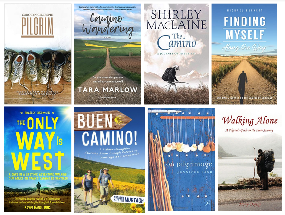
I started by finding examples of similar books. It could stand next to travel memoirs about pilgrimage and the Camino de Santiago like these:
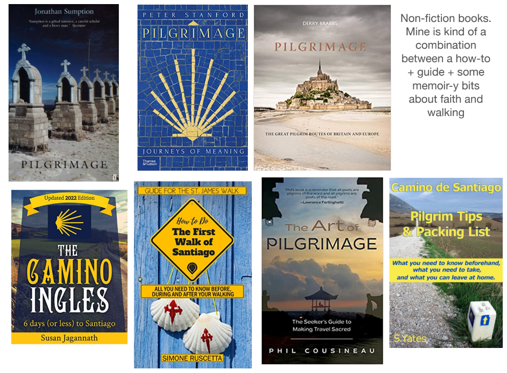
My book also has tips for multi-day walking and travel advice, as well as historical, religious, and spiritual aspects, similar to non-fiction books like these.
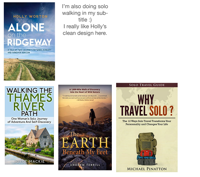
It's also a solo walking book, and I was particularly drawn to Holly Worton‘s solo walking guides.
I also provided Jane with some of my photos from the routes to incorporate in possible designs.
My cover designer came back with 6 alternatives
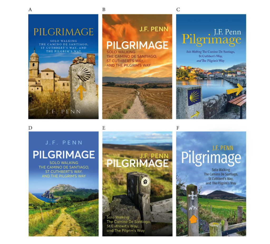
Jane came back with these designs, with varying color palettes, fonts, and emotional resonance. I included the route names in the sub-title in these early stages.
The images in C, E, and F are my photos from the Camino and the St Cuthbert's Way. The others are stock photos.
I did a poll with my Patrons to see which cover they preferred
I share a lot behind the scenes of my creative business with my patrons at Patreon.com/thecreativepenn and since they know me, and support my work, I wanted to see what they thought of the covers. (Thank you, patrons!)
I asked for feedback from those people who bought travel memoir books or were interested in the Pilgrimage book specifically. The results were clear.

I also asked two travel writer friends with many books between them. Both also said they preferred D.
But there were a few problems with this cover. The picture is a stock photo from one of the Camino routes, but it was not from any of my walks. It didn't feel right to use a picture that didn't reflect my routes on a personal travel memoir.
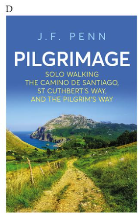
Of course, we all use images on our book covers that don't exactly match what's in the book. It's all about branding and genre resonance, about hooking a reader in.
But there was a more important issue.
The preferred cover was too happy and too sunny, and it felt like a glossy brochure for a perfect walk. The reality of my three pilgrimages — and my midlife searching for meaning — did not feel that way.
A cover must communicate the emotional promise of the book
This is the opening paragraph of Pilgrimage.
“In the middle of the journey of our life I came to myself within a dark wood where the straight way was lost.” —Dante Alighieri, The Divine Comedy
Pilgrimage attracts the seekers. Those with a question to answer, a problem to solve, a sin to atone for, an illness to be cured, a prayer to be answered. Pilgrims walk with a desire to make a change, to mark a boundary from one life to another, to heal, to escape.
I needed all of these, and more.
Perhaps you do, too.
It was important to me to use one of my pictures for such a personal book, and also to make it clear that the reality of pilgrimage (and mid-life) is more like climbing a mountain than skipping downhill without a care in the world.
Of course, there are moments of beautiful weather and incredible views and effortless flow on pilgrimage, but there are also days of walking while in pain in a storm questioning the meaning of life.
I asked for variations on my preferred cover
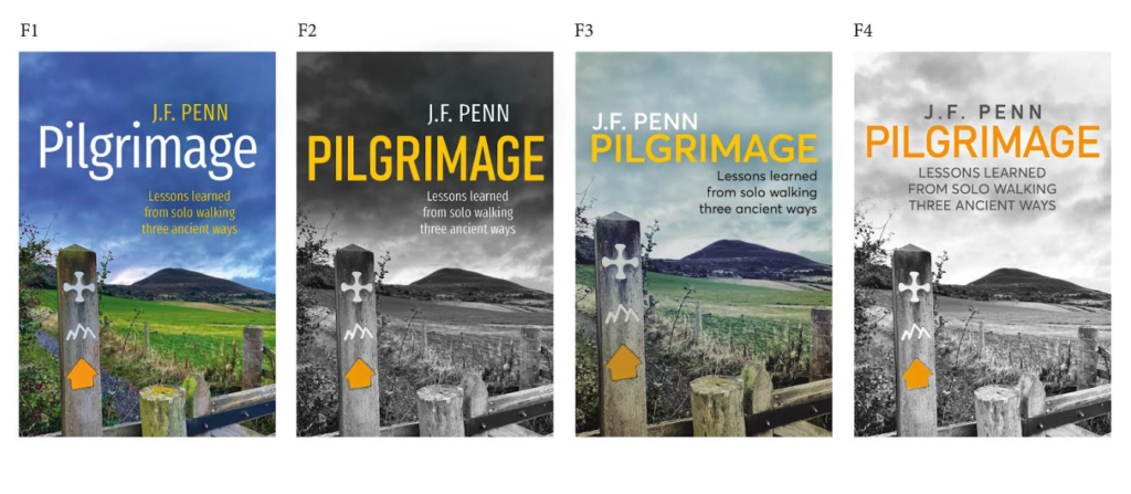
Even though cover F was the joint least favorite, it resonated with me and the content of the book.
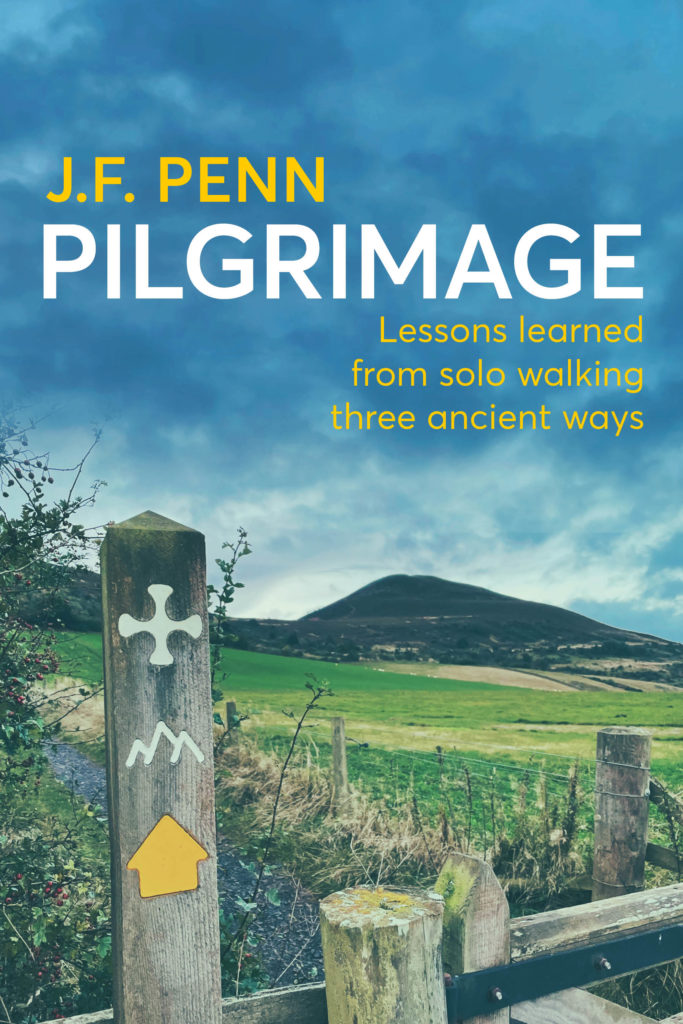
I remember that day on the St Cuthbert's Way, walking out of Melrose in Scotland over the saddle of the Eildon Hills. I write about the aftermath of it in Pilgrimage and the picture definitely captures the emotional aspects of solo walking pilgrimage during mid-life.
Jane did some more variations with the new sub-title.
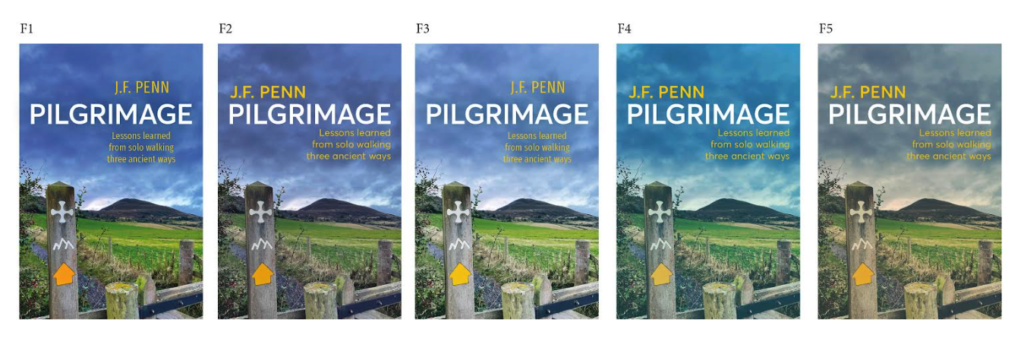
And then some more variations with different filters and shades of blue.
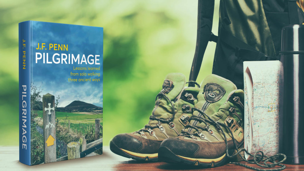
I finally settled on a cover that I am happy with!
Part of the joy — and the challenge — of being an independent author is that you get to choose your book cover.
I might have made a mistake, but equally, I might have chosen exactly the right cover for this book. Those who read it will be able to tell me!
You can buy Pilgrimage through my Kickstarter (launching 23 Jan, 2023)
There will be a special edition hardback that will only be sold as part of the Kickstarter, as well as early access to the ebook, audiobook (narrated by me), paperback, and workbook editions.
I share my lessons learned and insights from walking these ancient ways, as well as historical, religious and cultural aspects, and plenty of practical tips. There are also questions for you to consider around your own journey.
Click here to register on the Kickstarter pre-launch page

Part 1 goes into practical and spiritual preparation before pilgrimage, including how to make decisions about the route and whether to walk solo, as well as what to take with you, and how to face the fears that might hold you back.
Part 2 covers the journey itself with the practicalities of the pilgrim’s day, as well as how walking the path of history and facing the challenge of the way can give you much-needed perspective on life — and perhaps even a glimpse of the divine.
Part 3 addresses the arrival at your destination, and how to leave room for the gifts of pilgrimage to emerge after your return home, as well as how my three walks impacted my experience of mid-life.
At the end, you’ll find appendices with practical tips for each of the three ways, as well as a gear list and bibliography for further reading.
I hope you've found this process interesting, even if you disagree with my final cover. Please let me know in the comments if you have any questions, or if you've faced similar challenges with your book cover design.

I love going through your thought process on this cover! All of my walking book covers are photos that I’ve taken (thanks for sharing!), and I love that they take me back to where I was on my journey. I have a personal connection to each image. As I walk a route, I’ve always got my eye out for good cover shots. I really enjoy choosing a photo for my walking book covers.
Thanks, Holly, and your books have been an inspiration for mine in many ways.
I took many photos on the route but I wasn’t thinking about cover images, which are a certain kind of photo, for sure. I’ll have to consider that if I do another one, lol!
Love your books Holly!!!
This is a great post. I always think that the purpose of asking for the opinion of others on something is not actually to get their view but to clarify your own thoughts. That’s definitely what’s happened here and the result is not only spot on, but it also resonates with you personally which is important because, as you say to us all the time, ‘it’s your book’. Well done, Joanna.
Thanks, Imogen. This one was tough to get right, but I am really happy with it now! Thanks for your thoughts on pilgrimage and your encouragement for the Camino.
Joanna,
I was pleased to see Lance Buckley in your list of cover designers. Lance has done three covers for me. The latest for The Ghost of Mackey House was highly praised by Allyson Longuiera, cover designer for WMG Press.
Rob
P.S. See you in a couple weeks at Superstars!
Yes, see you at Superstars!
Thanks for sharing this. For my women’s fiction novel, I wanted to use a local artist whose work I liked, as opposed to stock art. She had never done cover art before, (probably my first mistake), but I trusted her. The end result was beautiful, and i love it, BUT. I really think potential readers pass it by bc it looks too religious-y. Lots of stained glass looking images. And, there are deep spiritual themes in the story, but it’s not a sweet/clean. I think I might have to re list the book with an entirely new cover, which a) ticks me off and b) it’s also on ingramspark and draft2digital, which I dont even know if I can edit there now. So discouraging.
I love the sound of your book, though! Although I dont see a pilgrimage for myself anytime soon I’d love to read about this one! Putting it on my TBR list..thanks again for sharing your cover journey
Thanks, Ellen, and yes, pieces of beautiful art are not necessarily a good idea for book covers. It’s a sales medium, after all. The goal is for people to buy the book.
Definitely do a new cover, that’s something we all do, and I have done multiple times on some books.
You can just upload the new cover to Ingram and D2D, it’s a normal part of the author business!
My eye went immediately to the one you picked. Nice choice!
Thanks, Linda!
I loved reading through your process, the quote from the beginning of the book, and the final cover. I can’t wait to read this – for what it’s worth, I’m more excited to read this than I have been for any of your other books or courses (and I’ve purchased all your courses). Thank you for facing your fears and doing all this, anyway.
Thanks so much, Julie. This is definitely the most personal book for me, and the most beautiful print product, and I am both scared and excited to get it out into the world!
That was a really interesting read. I’m interested to know if religion features heavily in the book because – to me – the title and the cover both suggest that (I say that as someone who has never done a hike, a long walk, or a pilgrimage).
Thanks, Cally. I do address this in the Kickstarter campaign as it’s a common question.
I am not a Christian, but I am a seeker, and the book does a chapter on my personal faith journey (how I found and lost it!) and also more spiritual moments.
I think ‘pilgrimage’ calls to certain people, whether they are religious or not, so the book is really aimed at them.
I answered the survey and remember choosing one of the least favored options. I didn’t think the stock photos fit your premise. Glad you settled on this one! The final design looks great.
Thanks for your input, Randal, and glad you like the final choice.
I found this super interesting! thanks so much for sharing your process of cover creation. I am the same as you — I wouldn’t want a photo of a place that I didn’t even mention in the book or walk. Your photo “E” is also a good choice. I am getting excited for you as you launch this book as I have been hearing your progress over time, walking, writing, thinking about memoir/guide book etc.
Thanks, Rachel, it’s been quite the journey, for sure 🙂
I think another cover would have had wider appeal and been more commercial.
But this cover was obviously chosen by someone who liked it for personal reasons. It says this is how you feel when the experience is over.
It makes me want to read about the experience that lead to that feeling.
You chose the right one.
We have to sell books, but we also have to feel good.
Thanks, Michael. And I definitely thought the ‘commercial appeal’ cover that was favored would have given the wrong impression of the book! Glad you like the final one.
This post couldn’t have come at a better time! I’ve been editing my husband’s book “We Ran Away to Sea,” and we’ve sent two of the designs from our cover designer to friends and artists. Eight out of ten people prefer the first cover, and only two prefer the last cover– which is favored by the designer and my husband, and me. Although it perhaps has too much detail, it captures the essence of the book, which is not so much a run-away have fun and adventures story (although there is some of that) but a chronicle of the stresses that the couple’s chosen lifestyle brings to their marriage and the difficult choices they make out of their love for each other. The less-liked cover is based on elements of a preliminary collage made by Pam, who is no longer alive, that made me exclaim, “This captures the essence of the theme of the book.” We still haven’t decided which cover to choose.
Joanna, I, too, like your choice of cover. I am a pilgrim who has walked many long caminos, followed many people’s blogs, and read many pigrimage books, including several with the covers you show here. I was a little skeptical when I learned you were writing a pilgrimage book — what do you have to say that others don’t?– but your subtitle makes me want to read your book. It is much more personal than most of the other covers, and as you say, not too sunshiny — and that does make me want to read it! I don’t need advice, or accounts of the difficulties and joys along the way — but I am deeply interested in What the pilgrimages mean to those who walk them, and how they have changed or affected their lives and perspectives. I hope to write my Camino story, too.
Thanks so much, Linnea. I had the same thoughts while writing the book. There are already so many Camino books, but this is structured around lessons learned and thematic chapters. I had hundreds of pages of repetitive walking notes which turned into a single chapter, and I only wrote about places that were less written about — a mural on a busy road in London, the crossing to Lindisfarne, a fossilized forest under the tidal waters of the Thames. I hope you will enjoy the book if you try it!
I loved your St Cuthbert picture immediately. It spoke to my heart of ancestors saying welcome.
Thank you. That walk was one of the best of my life.
Nice to see a few familiar camino books and authors in here!
Strangely, I made my guesses all the way through before reading yours, and I came to the same conclusion! Looking forward to the book.
Hi,
the photo you chose was the one I liked the best, it spoke of more than a walk along somewhere pretty to me, it spoke of journey.
Thanks for sharing your progress and showing that its okay to go with your gut feeling rather than what you think you should do.
Jenni
Thanks, Jenni, and yes, it was a “journey” in all senses of the word!
Having walked the Camino myself for a milestone birthday, I thought that the poll winner felt off to me Bc it looks like you’re going downhill…which I did eventually. Your chosen cover shows the difficult landscape but doesn’t point downhill. It’s almost like it’s looking at all the options & knowing you might not always take the easier path to your destination, but what a rewarding one! (If you wanted easy and less participative, you’d drive the nearest highway.)
Thanks, Lorna, and glad you understand the challenge of the Camino!