OLD POST ALERT! This is an older post and although you might find some useful tips, any technical or publishing information is likely to be out of date. Please click on Start Here on the menu bar above to find links to my most useful articles, videos and podcast. Thanks and happy writing! – Joanna Penn
One of the main reasons for self-publishing is creative freedom and control.
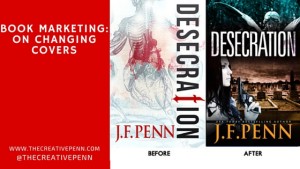 Many of us regularly update book blurb/descriptions, as well as changing categories and keywords. I've also blogged before about making sure non-fiction book titles are based on keyword research.
Today I'm talking about changing book covers because within a few hours, you can completely change the look and emotional impact of your book. When authors like Polly Courtney have resigned over the cover branding for their books, this seems like the ultimate indie freedom.

It gets brilliant reviews, so once people read it, they love it. But not enough people were trying it … sure, I haven't done any specific promotion, but based on my other book sales, it should be doing better.
The ‘aha' moment
Russell Blake, the author who has sold over 400,000 thrillers and now writes with Clive Cussler, wrote a post in Feb 2014 about tweaking his covers. Russell changes covers in order to “find one that resonates with my readership – as expressed in increased sales.”
He changed the cover on one specific book, Fatal Exchange, four times before settling on the latest iteration – which moved from a theme based to a person based cover.
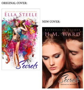
“COVERS ARE STOP SIGNS. They should quickly reveal as much info about your book to the reader as possible and this did not. As soon as I changed the covers to the current version, sales shot up … Short version: I was really stupid. Don’t wait 9 months to change covers or descriptions on books that aren’t preforming.”
These two fantastic indie authors provided me with an ‘aha' moment, and this is what I decided.
My mistake #1: Theme over character
I always have a strong theme in my books, and for Desecration the main theme is anatomy and whether the physical body actually defines who we really are. Yes, this is a deep and meaningful topic and I explore the use of the physical body in life through tattoos, body modification and alternative nightclub Torture Garden. I also write about the use of the body after death in medical specimens and corpse art.
But mainly it's a murder mystery with a British detective, Jamie Brooke, whose daughter is dying. Jamie will do anything to protect her daughter in life … and in death.
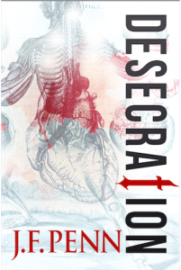
For the second cover, the brief was: grieving mother who will do anything to avenge the wrong done to her daughter, and to bring justice to the murder victim. It was all about character.
My mistake #2: Not meeting genre expectations
Desecration is a crime thriller, with an edge of horror in parts. It's certainly not for the squeamish. It has a dark tone and a 
People have also said the original cover looks very arty, very literary fiction. The font down the side is beautiful but not easily readable and the word ‘Desecration' is difficult for some anyway. It's the HM Ward mistake – falling in love with the art, and not thinking of the reader expectation first.
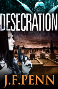
The white cover also didn't really fit with my other J.F.Penn books which are all dark. The new image of all my books together looks a lot better with another dark book in the frame, as above right.
Comments from Derek Murphy, my cover designer

“We tried a lot of ideas with the first round for Desecration, using mostly symbolic elements. Joanna previously had been adverse to using people on covers so we kept things simple; the final cover she chose is interesting and unique – but wasn't selling well. Here are some reasons why:
1. No emotional connection. Emotion is mostly a matter of scene, color and contrast, although adding characters can help a lot as well.
2. People usually sell covers. Even if a little cliche or overused, stock photo models seem to increase sales.
3. No genre identification. Symbolic covers are better for non-fiction. The stern white, while clinically suitable, probably seemed too much like a non-fiction book. At the very least it was unclear what the book was about – this could have been improved with a tagline.
4. No depth. Adding a scene lets readers know more about the setting and feels more like they can ‘walk into' the story. It's tough to pull off a flat, symbolic cover (even though major bestsellers seem to use them, like the Game or Thrones series, Twilight, Shades of Gray, etc.)
You can find Derek at Creativindie Book Covers, and he also has this great post about DIY Covers in MS Word, as well as a fantastic program to help authors with book cover design. You can find more cover designers here.
The new cover
I am really happy with the new cover!
I spent over 5 hours trawling through all the image sites looking for my idea of Jamie Brooke, the main character. This model totally fits the bill. Of course, British police detectives don't carry guns, but I decided a little artistic license would suit the American audience more 🙂
I've also just uploaded the new print covers to Createspace, so if you have one of the older cover print books, it is officially a limited edition!
In terms of results, it's difficult to say yet. The ranking on the Amazon.com store has moved from ~200,000 to ~50,000, but I have also been involved in other promotions this month. It will be best to wait a few months and see how the average sales are over time.
Tweaking my other covers

I also searched hard for this model, who fits incredibly well since my Dr Morgan Sierra is closely modeled on Lara Croft!
Although it's hard to do any kind of split testing when you only have one book, I have now had two free runs on BookBub for Pentecost.
The first run resulted in ~20,000 free downloads. This latest run with the new cover resulted in over 30,000 downloads. I can't directly attribute it to the addition of the female figure, but at least it shows that the cover change wasn't detrimental, and could mean it was a positive move. Pentecost is still free on all stores if you fancy trying it.
OK, I would love to hear what you think. Firstly, what do you think of my cover change? Do you think the new covers are more effective? Also, have you changed your own covers and has this impacted sales? Please leave a comment below.
Hello,
I’m new on the book writing scene. My 1st book Eva a tale of love lies and luxury was released on Oct 7th 2015. To date I’ve sold 300 ebooks.
Before seeing your article I wondered if testing multiple book covers could be done.
My question: Can I post the same book, using 2 different book covers at the same time…Nothing in the actually book would be different other than the cover.
No, you can’t have duplicate content on the stores. Congrats on the great sales with your first book.
Joanna thanks for the reply.
I wanted to create an book cover that was a little different than other erotica books. I wanted to stay away from the sexy girl leaning on a limo or posed in lingerie. Now that my book is available Amazon I’m not sure if the direction I took was the most sound.
Can you look at my ebook cover and tell me what you think of it?
“Eva a tale of love, lies and luxury.”
Thank you.
Joe
Do you having stock photo models on book covers works best in some, but not all, genres? The reason why I ask is because I noticed many of the best selling science fiction and fantasy ebooks don’t have people on their covers (compared to romance/thrillers/etc.).
Just curious.
I’d say there are no rules! Look at the top 100 bestselling books in your genre and then decide.
I have book in black and white and I am thinking about making it in color, should I change the title or make it with same title. What would you recommend?
When you change the cover, is it considered a second edition?
No, the interior is the important change for a new edition.